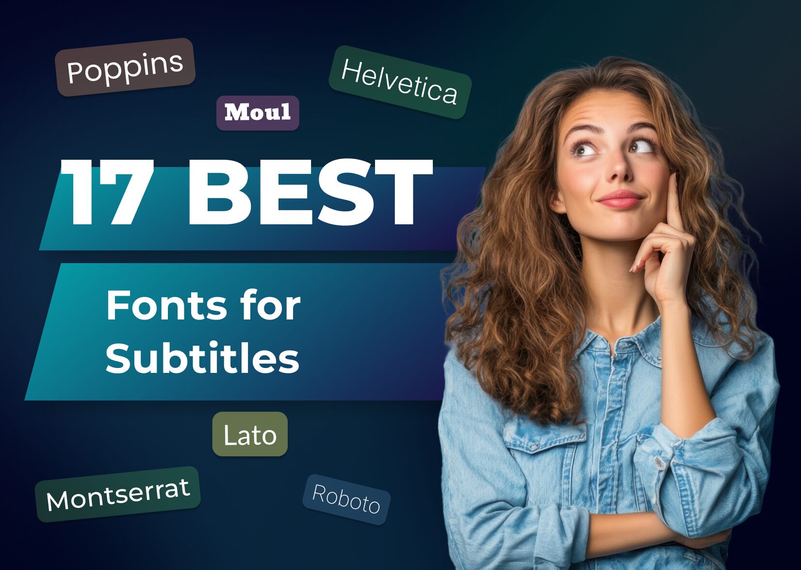
17 Best Subtitle Fonts: Expert Guide to Professional Video Captions (2025)
When you’re creating video content, selecting the right font for your subtitles can make or break your viewer’s experience. While it might seem like a small detail, the font you choose plays a crucial role in ensuring your message reaches your audience effectively.
Creating readable subtitles isn’t just about picking any font that looks good – it’s about finding the perfect balance between style and functionality. Your subtitles need to be clear and legible across different screen sizes and viewing conditions while maintaining visual harmony with your content. Whether you’re producing professional tutorials, engaging social media content, or compelling documentaries, understanding the key factors that make subtitles work will help you make informed decisions about your font choices.
Key Takeaways
- Sans-serif fonts like Arial, Helvetica, and Roboto are optimal choices for subtitle readability across different screens and viewing conditions.
- Font selection should balance visual appeal with functionality, ensuring subtitles remain clear and legible while complementing the video content.
- Different video types require specific font considerations – educational content benefits from Open Sans, documentaries from Helvetica, and social media from Arial.
- Key technical features to look for in subtitle fonts include consistent stroke width, clear spacing, and good character recognition at smaller sizes.
- The most versatile subtitle fonts offer multiple weights, maintain readability across devices, and perform well against varied backgrounds.
The Best Font Choices for Subtitles and Captions
Sans-serif fonts deliver optimal readability for video subtitles across different screen sizes and viewing conditions. Here’s a comprehensive analysis of 17 proven fonts that enhance subtitle legibility while maintaining visual appeal.
1. Arial
Arial’s clean lines and neutral design create clear subtitles at any size. Its compact letterforms maintain readability at 22pt, and its consistent stroke width ensures visibility against varied backgrounds.
2. Helvetica
Helvetica features a concrete, holistic design with strong character recognition. Its balanced letterforms and clear spacing work effectively at multiple sizes, making it ideal for professional video content.
3. Roboto
Roboto’s geometric design provides a natural rhythm in subtitle text. Its mechanical layout accommodates long sentences while maintaining clarity, making it Google’s and YouTube’s standard subtitle font.
4. Open Sans
Open Sans combines uniform strokes with humanist details for enhanced screen legibility. Its versatile weights adapt to different video styles while maintaining consistent readability across devices.
5. Lato
Lato balances geometric precision with rounded details for smooth readability. Its semi-rounded letterforms reduce eye strain during extended viewing, particularly effective in educational content.
6. Verdana
Verdana’s pixel-oriented design adjusts to screen resolution automatically. Its wider letterforms and increased character height improve legibility on low-resolution displays.
7. Times
Times delivers formal elegance with practical readability. Its refined serifs add sophistication to documentary subtitles while maintaining clarity in smaller sizes.
8. Poppins
Poppins combines geometric influences with balanced proportions. Its clean circles and consistent strokes create legible subtitles for modern video content.
9. Rubik
Rubik’s distinctive design maintains clarity without sacrificing character. Its slightly rounded edges enhance readability while adding subtle personality to captions.
10. Georgia
Georgia’s larger-than-average letters excel in screen display. Its warm character shapes and generous spacing enhance subtitle legibility on mobile devices.
11. Arvo
Arvo’s slab serif design creates solid, distinctive subtitles. Its block-like serifs maintain clarity while adding visual interest to caption text.
12. Quicksand
Quicksand’s rounded geometry offers modern subtitle aesthetics. Its open letterforms ensure readability across varying background conditions.
13. Montserrat
Montserrat blends vintage inspiration with contemporary clarity. Its balanced letterforms work effectively in bold weights for professional video content.
14. Lora
Lora’s subtle serif details enhance subtitle elegance. Its open letterforms maintain readability at smaller sizes without compromising style.
15. Cabin
The Cabin’s slightly curved design creates friendly, accessible subtitles. Its condensed structure maximizes space efficiency without reducing legibility.
16. Josefin Sans
Josefin Sans delivers clean lines with distinctive character. Its geometric forms create modern subtitles while maintaining essential readability.
17. Tahoma
Tahoma’s uniform character width ensures consistent subtitle display. Its clear letterforms and versatile layout adapt well to multiple video platforms.
Font Recommendations for Different Video Types
Educational Videos
- Open Sans creates clear readability for instructional content
- Roboto enhances comprehension with its geometric precision
- Arial maintains consistent legibility for complex terminology
Documentary Films
- Helvetica provides a professional aesthetic for formal narratives
- Verdana adjusts pixel orientation for historical footage
- Montserrat offers modern clarity for contemporary documentaries
Social Media Content
- Arial ensures compatibility across multiple platforms
- Open Sans adapts seamlessly to various screen sizes
- Roboto Condensed maximizes space for short-form videos
Corporate Presentations
- Helvetica projects authority in business communications
- Arial maintains professionalism across internal videos
- Verdana enhances readability in data-heavy segments
| Video Type | Primary Font | Alternative Font | Best Use Case |
| Educational | Open Sans | Roboto | Complex instructions |
| Documentary | Helvetica | Verdana | Long-form content |
| Social Media | Arial | Open Sans | Quick consumption |
| Corporate | Helvetica | Arial | Professional setting |
Technical Tutorials
- Roboto supports detailed step-by-step instructions
- Open Sans displays code segments with clarity
- Arial maintains consistency in technical terminology
- Montserrat adds contemporary style to creative videos
- Open Sans adapts to fast-paced scene changes
- Verdana ensures readability during action sequences
TikTok Subtitles
- Arial: Simple and clean, ensuring readability on smaller screens.
- Helvetica: Classic and widely used for its clarity and professional look.
- Futura: Modern and sleek, ideal for trendy and aesthetically pleasing content.
YouTube Subtitles
- Roboto: A popular choice for its modern look and excellent readability in various sizes.
- Open Sans: Friendly and neutral, widely used across the internet for its versatility.
- Verdana: Specifically designed for screen readability, making it a great choice for video content.
Gaming Subtitles
- Bebas Neue: Bold and impactful, suitable for high-energy gaming content.
- Congenial: A sans-serif font that is clear and easy to read, even during fast-paced gameplay.
- Share Tech Mono: A more technical, digital look that fits well with gaming themes.
How to Pick Fonts for Subtitles?
Picking the right subtitle font doesn’t have to be complicated. Start by considering your video’s purpose and target audience. If you’re creating educational content, stick with proven options like Open Sans or Roboto. For a more professional look, you can’t go wrong with classics like Helvetica or Arial.
Remember that readability should always be your top priority. The best subtitle fonts will work well across different devices and screen sizes while staying crisp and clear. Test your chosen font on multiple platforms to ensure it maintains its legibility.
Your viewers will thank you for taking the time to choose a font that enhances their watching experience. With the right font, your subtitles won’t just be readable – they’ll be an integral part of your video’s success.
FAQ
What makes subtitle fonts important for videos?
Subtitle fonts significantly impact viewer experience and content accessibility. The right font ensures that viewers can easily read and understand the content across different devices and screen sizes, ultimately affecting how long they engage with your video content.
Which fonts work best for educational video subtitles?
Open Sans and Roboto are highly recommended for educational videos. These fonts offer excellent readability and maintain clarity even when displaying complex information. Their clean design helps viewers focus on learning without getting distracted by fancy typography.
What fonts should I use for social media video subtitles?
Arial and Open Sans are ideal for social media videos. These fonts are universally compatible across platforms, maintain readability on small screens, and work well with fast-moving content. They’re also optimized for mobile viewing, where most social media consumption occurs.
How do sans-serif fonts improve subtitle legibility?
Sans-serif fonts enhance subtitle legibility by providing clean, straightforward letterforms without decorative elements. Their simple design makes them easier to read quickly, especially on digital screens where complex fonts might appear cluttered or pixelated.
Which fonts are best for corporate video subtitles?
Helvetica and Arial are the top choices for corporate videos. These fonts project professionalism and authority while ensuring excellent readability. Their clean, modern appearance aligns well with corporate branding and maintains consistency across professional presentations.
What font size should I use for video subtitles?
The recommended subtitle font size typically ranges between 28 and 32 points, depending on the video resolution. This size ensures readability across devices while not overwhelming the visual content. Always test your subtitles on different screen sizes before finalizing.
Can I use decorative fonts for video subtitles?
Decorative fonts are generally not recommended for subtitles. They can reduce readability and accessibility, potentially frustrating viewers. Stick to clean, professional sans-serif fonts that prioritize clarity over style.
How do I ensure subtitle fonts work across all platforms?
Choose widely supported fonts like Arial, Helvetica, or Roboto that are available across different operating systems and devices. Always test your subtitles on multiple platforms and screen sizes before publishing.
More articles
The Best Place to Buy Instagram Followers Safely in 2026
As of April 2026, the dominant visual social platform has evolved. Organic reach is now heavily dictated by short-form video recommendations rather than the chronological feeds of your existing network. While acquiring a synthetic subscriber base is a widespread tactic for boosting initial “social proof,” it is critical to understand the core reality: these purchased […]

150+ Best Vacation Instagram Captions to Make Your Travel Photos Pop
Planning your dream vacation is exciting, but finding the perfect words to accompany those stunning photos can be challenging. Whether you’re lounging on a tropical beach, exploring ancient ruins, or hiking breathtaking mountains, the right caption can elevate your Instagram post from ordinary to unforgettable. You’ve packed your bags for the family vacation, created memories, […]

175+ Unforgettable Prom Instagram Captions to Make Your Night Shine | 2025 Edition
Capturing the magic of prom night on Instagram requires more than just stunning photos – you need the perfect caption to complete your post. Whether you’re looking for something sentimental, funny, referencing your favorite song lyrics, or the photos from the dance floor, the right words can make your prom memories shine even brighter on […]