The Ultimate Guide to Choosing the Best Fonts for Captions in Video Editing
If you open any video-centric social media platform, you’ll hardly find a video without any text on its cover, let alone one without text on the video itself. Video captions have evolved far beyond being just an accessibility aid. Whether you’re creating TikTok videos, professional documentaries, or marketing content, choosing the right font for your captions can make or break your viewers’ experience.
In this guide, we’ll dive into everything you need to know about selecting the perfect fonts for your video captions. From readability and accessibility considerations to style matching and technical requirements, we’ll explore the key factors that should influence your font choice. Plus, we’ll share our top subtitle font recommendations for different video styles and show you how AI-powered tools can streamline your captioning workflow. By the time you finish this guide, you’ll be equipped with everything you need to make your captions as impactful as your content itself.
All About Fonts for Subtitles
What Are Subtitle Fonts?
Subtitle fonts are typefaces specifically selected for displaying text overlays in video content. While there’s no specific division into subtitle and non-subtitle fonts, some have a more suitable design for captions in videos. Unlike standard text fonts, subtitle fonts need to meet specific requirements for on-screen legibility across different devices and viewing conditions. These fonts come in various styles but typically favor clean, straightforward designs that prioritize readability over decorative elements. Think of a classic yellow subtitle look: no matter which font is used, the caption always reads easily without distracting the viewer’s attention from the video.
Why Is Choosing the Right Font Important?
The font you choose for captions directly impacts how viewers engage with your content. A good caption font ensures your audience can easily read and understand the words without getting distracted from the visual elements. Poor font choices can lead to viewer fatigue, reduced engagement, and even cause people to stop watching altogether.
For content creators targeting international audiences or complying with accessibility standards, font selection becomes even more crucial. As closed captions primarily serve as an accessibility aid for viewers with hearing impairments or non-native language speakers, creators must use legible fonts that contribute to an easy understanding of content and do not require extra time to read.
Key Factors to Consider When Choosing Fonts for Subtitles and Captions
Before settling on a font for video subtitles, consider these essential factors. First, readability is paramount – the font should be clear to create readable subtitles of various sizes and against different backgrounds. Contrast plays a vital role, as your text needs to remain visible regardless of the scene’s lighting or color palette. Character spacing and line height should provide enough breathing room without taking up too much screen space. Additionally, it’s important to consider the font’s weight options – you might need different weights for emphasis or varying background conditions. Finally, think about your content’s style and audience – while a tech tutorial might benefit from a modern sans serif typeface, a historical documentary might call for a more classic style, as long as it maintains legibility.
Free vs. Paid Subtitle Fonts: Pros and Cons
When deciding between free and paid subtitle fonts, it’s essential to understand what you’re getting – and potentially missing out on – with each option. Free default fonts, like those available on Google Fonts, have come a long way in recent years and now offer remarkable quality that rivals many paid options. They provide excellent accessibility, instant availability, and the ability to experiment without financial commitment. Many free fonts, such as Open Sans and Inter, are specifically optimized for screen display and come with comprehensive character sets.
However, paid fonts bring their own advantages to the table. Premium options like Helvetica often offer more extensive font families with multiple weights and styles, giving you greater creative flexibility. They typically feature more refined kerning (letter spacing), better hinting (screen optimization), and additional special characters. Paid fonts might also provide exclusive rights or limited usage, helping your content stand out from competitors using common free alternatives. Additionally, commercial fonts often come with dedicated technical support and regular updates.
The good news? You don’t necessarily need to break the bank for professional-looking captions. Many free fonts are more than capable of meeting high production standards, especially when used thoughtfully. The key is to focus on your specific needs: if you’re just starting out or creating content for platforms like YouTube or TikTok, free fonts are likely your best bet. However, if you’re working on high-end commercial productions or need specific branding consistency across multiple media types, getting a paid font might be a worthy investment. Plus, many video editors allow users to upload custom fonts, so you can go as far as creating your own special font for your captions. Remember, it’s not about how much you spend – it’s about choosing a font that serves your content and audience effectively.

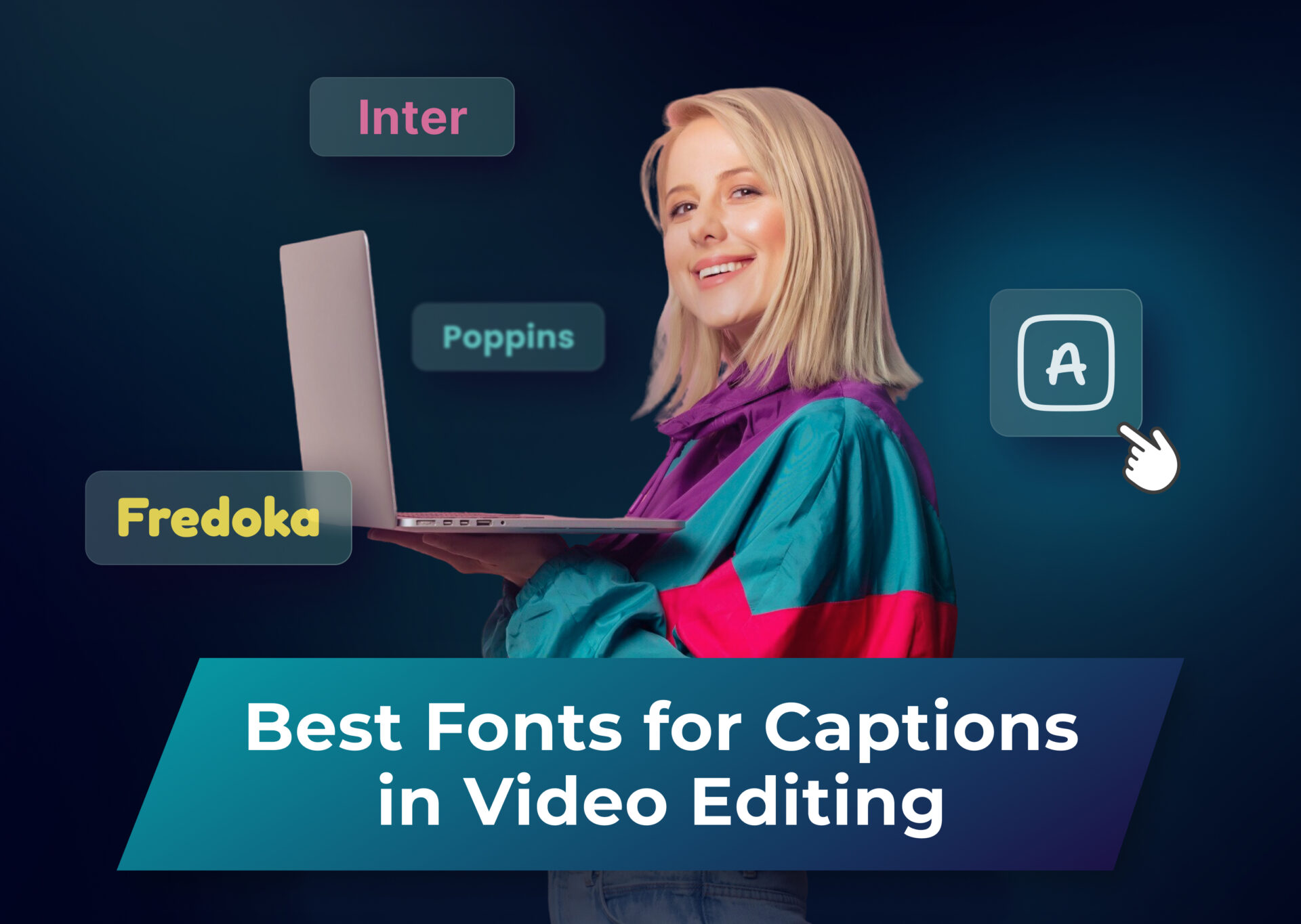
ALT: Whether you create YouTube videos or TikTok clips, find the best fonts for subtitles in this guide.
Top 8 Best Fonts for Subtitles and Captions: Dubs’ Choice
We’ve curated a list of fonts for subtitle text that consistently deliver outstanding results across different video styles and platforms. Each font in our lineup offers the perfect balance of readability, style, and versatility, making them reliable choices for creators who want their captions to enhance, not distract from, their content.
Arial
Price and availability: free to use, available on Google Fonts
Best for: general-purpose videos (vlogs, tutorials, interviews)
The absolute classic of subtitle fonts, Arial combines excellent readability with universal compatibility. Its neutral design and well-balanced character spacing make it a reliable choice for any video type, be it movie subtitles or a TikTok read-along, while its varied weight options ensure your captions remain clear against any video background. Pro tip: for a trendier look, try using Arial Italic or playing around with Arial Bold.
Montserrat
Price and availability: free to use, available on Google Fonts
Best for: modern, sleek videos (tech, business, lifestyle)
With its geometric precision and contemporary feel, Montserrat brings a touch of sophistication to your captions. The font’s clean lines and well-measured height make it exceptionally readable even at smaller sizes and in lowercase letters, while its modern aesthetic perfectly complements tech-forward content.
Open Sans
Price and availability: free to use, available on Google Fonts
Best for: educational content, explainer videos, corporate presentations
Designed with screen readability in mind, Open Sans excels in clarity and professionalism. The friendly appearance and excellent character distinction of this widespread font make it perfect for longer captions, ensuring viewers can comfortably follow along with detailed explanations.
Lato
Price and availability: free to use, available on Google Fonts
Best for: lifestyle, fitness, and travel vlogs
Lato is a relatively simple font that strikes an ideal balance between professionalism and warmth. Its semi-rounded details create a welcoming feel, while its strong structure ensures excellent legibility even when overlaid on dynamic, fast-moving lifestyle content.
Helvetica
Price and availability: paid, available via Adobe Fonts and commercial font sites
Best for: professional, high-quality content (films, documentaries, ads)
The gold standard in professional typography, Helvetica delivers unmatched clarity and versatility. Its premium design and perfect letter spacing justify its cost for high-end productions where every detail matters. For a modern and trendy look that still delivers the premium vibe, try Helvetica Medium Italic.
Inter
Price and availability: free to use, available on Google Fonts
Best for: digital content, UX/UI-related videos, and tech reviews
Optimized for screen display, Inter shines in digital-first content. Its carefully crafted letterforms and extensive weight options make it highly adaptable while maintaining exceptional readability across all devices, making it a popular font and a go-to choice among sans serif typefaces for many scenarios.
Fredoka
Price and availability: free to use, available on Google Fonts
Best for: fun, playful videos (kids’ content, social media, lifestyle vlogs)
Fredoka’s rounded, bubbly design makes it highly readable while adding a friendly and modern touch to captions. It’s great for informal and energetic content where personality and playfulness matter without being a too highly stylized font.
Poppins
Price and availability: free to use, available on Google Fonts
Best for: modern and trendy videos (startup pitches, influencer content, ads)
Last but not least, the friendly look of Poppins captures the zeitgeist of modern digital design. Its distinctive yet highly readable style makes captions pop without overwhelming the viewer, perfect for content that needs to feel current and engaging.
Crucial Factors to Consider When Choosing a Subtitle Font
Readability
We can’t stress this enough. When it comes to the best fonts for video subtitles, readability isn’t just a nice-to-have – it’s essential. Your chosen font needs to be easily legible at various sizes and viewing distances, even when viewers are watching on smaller screens or in less-than-ideal conditions. Look for font families with clear letterforms, uniform stroke width and letter height, adequate spacing between characters, and distinct shapes for similar letters (like capital ‘I’ and lowercase ‘l’). Sans serif fonts typically perform better for on-screen text, as their clean lines remain clear even at smaller sizes. Another key aspect to consider is the font’s weight – it should be bold enough to stand out against changing backgrounds but not so heavy that letters blur together. Alternatively, contrast can be achieved with a backstroke of a different color or light shadow applied to the caption.
Compatibility with Video Content
Good video subtitles should complement your video’s visual style without competing for attention. For instance, a sleek tech review demands different typography than a vintage-style documentary where even Times New Roman (not quite a go-to subtitle font) can shine. Consider your video’s pace as well – fast-moving content might require slightly larger or bolder fonts to ensure viewers can keep up. The font should also work well with your color scheme and maintain legibility across various scene types, from bright outdoor shots to darker indoor scenes. Remember, the goal is to enhance the viewing experience, not distract from it.
Brand Consistency
Your choice of subtitle font contributes to your overall brand identity. If you make content for a specific brand or channel, your caption font should align with your established visual identity. This doesn’t mean using your brand’s display font for subtitles (even a simple display font like Arial Black could harm readability), but rather finding a subtitle font that captures your brand’s personality while maintaining functionality. For instance, a luxury brand might opt for a more refined sans-serif, while a tech startup might choose something more modern and geometric.
Technical Considerations
The technical aspects of font selection can make or break your caption game. First, ensure your chosen font supports all the characters you need, including special characters and diacritical marks for multiple languages. Consider file size and loading times, especially for web-hosted videos where you upload subtitles as a separate file. Check if the font renders properly across different platforms and devices – what looks perfect on your editing screen might appear differently on, say, Google’s Android interface. Also, verify the font’s licensing terms, particularly for commercial use. Finally, consider whether the font offers multiple weights and styles, giving you the flexibility to adapt to different caption needs within your videos.
How to Elevate Your Subtitles and Captions with Typography Principles
Great subtitles don’t just happen by chance – they’re crafted using time-tested typography principles that enhance readability and viewer experience. Mastering these fundamental design elements will take your captions from merely functional to exceptionally polished. Let’s explore the key typographic principles that will help your subtitles stand out while remaining perfectly legible and professional.
Font Size and Scaling
Getting your caption size right is all about striking the perfect balance. As a general rule, subtitles should occupy no more than 1/12th of the total screen height, making them large enough to read comfortably but small enough to avoid dominating the frame. Scale your font size proportionally across different video resolutions – what works at 1080p might need adjustment for 4K content. For mobile-first content, consider going slightly larger, as viewers often watch on smaller screens. Remember to test your captions at various viewing distances and screen sizes before finalizing your edit.
Font Color and Contrast
Sharp contrast is crucial for caption legibility. While white or yellow subtitle text remains the industry standard, it’s not just about picking a color – it’s about ensuring your captions stay readable across every scene. Use a subtle outline or shadow to maintain legibility when your text overlays bright or complex backgrounds. Avoid pure black outlines as they can appear harsh; instead, opt for dark gray or softened edges. For brand-specific font colors, always test them against various background scenarios to ensure they maintain sufficient contrast.
Spacing and Positioning
Smart spacing transforms good captions into great ones. When you add subtitles, it’s always good practice to opt for shorter, spaced-out captions that do not fatigue the eye. Keep line spacing (leading) at roughly 20% more than your video font size to prevent overlapping while maintaining a visual connection between lines. For positioning, place your closed captions in the lower third of the screen, unless there’s crucial action or graphics in that area. Maintain consistent margins from the edges of the frame, typically 10-15% of the screen width. Break longer captions into two lines maximum, with natural speech breaks guiding your line breaks.
How to Add and Style Captions and Subtitles with Dubs
Creating polished, professional captions is much easier with specialized captioning tools like Dubs. This AI-powered platform offers everything content creators need to create subtitles, translate and dub videos, add captions, and optimize videos for better visual appeal and enhanced performance.
Here’s what the Dubs app can do:
- Add text to video: with several default fonts available, as well as the possibility to add custom fonts, Dubs ensures your captions stay on point.
- Automatically add subtitles: the advanced AI algorithm can transcribe speech into automatic subtitles with an astounding 98% accuracy.
- Translate video subtitles and captions: Dubs supports 150+ languages for smooth translation that preserves both the original style and tone.
- Add AI dubbing: subtitles are one thing, but imagine speaking any language in the world in your videos! Dubs replicates the speaker’s voice and intonations, creating natural-looking and sounding footage.
- Edit videos: trim, overlay, merge your videos, apply animations, add captions in different fonts, and try other editing features to make your content truly eye-catching.
Need to match your brand’s style guide? Dubs makes it simple to save your preferred caption settings as custom presets, ensuring consistency across all your content. Whether you’re creating content for social media, educational platforms, or professional distribution, Dubs streamlines the entire captioning process while giving you the creative control you need to make your videos shine. With Dubs, professional-quality captions aren’t just an afterthought – they’re an integral part of creating engaging, accessible video content.
Troubleshooting Common Subtitle Font Issues
Missing or Incorrect Fonts
When your carefully chosen font appears as a default system typeface, it’s usually because the font isn’t properly embedded or supported on the viewing platform. To fix this, either ensure your font files are properly packaged with your video or stick to widely supported fonts that are available across most systems. If you’re using a custom font, consider including a fallback font that maintains similar proportions to your primary choice.
Blurry or Pixelated Text
The reason for blurry or pixelated captions is often the resolution mismatch or incorrect font scaling. For the fix, always test your captions at your video’s final output resolution, and avoid scaling fonts up from a lower resolution. For the crispest results, create your captions at the same resolution as your final video export.
Character Encoding Problems
Characters displaying as boxes or question marks typically indicate missing language support in your chosen font. Before finalizing your font choice, verify that it includes all the characters and diacritical marks needed for your content. If you work with multiple languages, consider using a font family specifically designed for multilingual support.
Layout and Positioning Issues
If your captions are cutting off or wrapping incorrectly, you might be dealing with margin or safe area issues. Ensure your caption positioning accounts for different screen sizes and aspect ratios by keeping text within standard title-safe areas (about 90% of the frame width). For streaming platforms, test your captions on multiple devices to verify proper display.
Remember, many font issues can be prevented by thoroughly testing your captions across different devices and platforms before publishing. When in doubt, opt for proven subtitle fonts with broad compatibility and strong legibility ratings.
Make Your Captions Count: Final Thoughts on Caption Fonts
Choosing the right font for your video captions might seem like a small detail, but it can significantly impact your content’s effectiveness and accessibility. Every aspect of caption typography plays a crucial role in creating a seamless viewing experience. There is no standard subtitle font, just like there is no universal best subtitle font for every occasion and scenario. Choosing the right subtitle font is all about keeping several aspects in mind: your visual aesthetic, theme, captions type, target audience, and many more. Pick fonts that resonate with your content and brand – this is always the best way to go. Remember that the best subtitle font isn’t necessarily the trendiest or most expensive one – it’s the one that serves your content and viewers most effectively.
As video content continues to dominate online spaces, well-designed captions are essential for reaching wider audiences and maintaining viewer engagement. Whether you’re using audience favorites like Arial and Montserrat or exploring other options, always prioritize readability and consistency over purely aesthetic choices. And with AI-powered tools like Dubs, creating professional-quality captions has never been more accessible.
Ready to take your video captions to the next level? Start by experimenting with the fonts and principles we’ve covered in this guide. By following these guidelines and using the right tools, you’ll create captions that not only look professional but also serve your audience effectively across all platforms and devices.
More articles
The Best Place to Buy Instagram Followers Safely in 2026
As of April 2026, the dominant visual social platform has evolved. Organic reach is now heavily dictated by short-form video recommendations rather than the chronological feeds of your existing network. While acquiring a synthetic subscriber base is a widespread tactic for boosting initial “social proof,” it is critical to understand the core reality: these purchased […]

150+ Best Vacation Instagram Captions to Make Your Travel Photos Pop
Planning your dream vacation is exciting, but finding the perfect words to accompany those stunning photos can be challenging. Whether you’re lounging on a tropical beach, exploring ancient ruins, or hiking breathtaking mountains, the right caption can elevate your Instagram post from ordinary to unforgettable. You’ve packed your bags for the family vacation, created memories, […]

175+ Unforgettable Prom Instagram Captions to Make Your Night Shine | 2025 Edition
Capturing the magic of prom night on Instagram requires more than just stunning photos – you need the perfect caption to complete your post. Whether you’re looking for something sentimental, funny, referencing your favorite song lyrics, or the photos from the dance floor, the right words can make your prom memories shine even brighter on […]